A Mixin Approach to Material Design Lite Using Sass
The way we use CSS has often seemed upside-down to me, but with Sass we can set it right way up again. Here we’ll describe an approach that uses Sass to make use of the Material Design Lite stylesheets, yet still keeps our markup clean.
CSS
Why do I say CSS seems upside-down?
Take a simple structure like a link element inside a navigation area, that is itself within the main content of a page:
<main>
  <nav>
    <a href="...">Get Started</a>
  </nav>
</main>
In most projects authors will usually add classes to these kinds of structures to indicate how they’d like the link element to appear. Using the Material Design Lite (MDL) library as an example, the recommended way to mark up a button is something like this:
<main>
  <nav>
    <a href="..." class="
      mdl-button
      mdl-button--colored
      mdl-js-button
      mdl-js-ripple-effect
    ">
      Get Started
    </a>
  </nav>
</main>
Although MDL is not to blame, this way of doing things is daft – upside-down, almost – for lots of reasons.
First, because the four classes we’ve added are not telling us anything we don’t already know about the structure; second, because we’re marking up individual elements rather than using global CSS rules; and third, because we’ve tied our markup to the MDL classes, making it difficult to change in the future.
Let’s look at each of these problems.
The Classes Are Not Adding Semantic Information
We say that the classes are adding no additional semantic information about the role of the link element within the structure. What we mean by that is simply that we already know from the hierarchy:
main > nav > a
what the purpose of the link is, and so adding the additional classes tells us nothing more. Consequently, the only reason for adding the classes is to provide presentation hooks.
It’s not like the old days when our markup might have consisted of a bunch of indistinguishable div elements, and so classes were attached that clarified each div’s purpose:
<div class="main">
  <div class="nav">
    <a class="button">etc.</a>
  </div>
</div>
But nowadays we have a ton of semantic elements in HTML5 – such as main, section, header, and so on – that tell us all about their content, and that means we don’t need these extra classes.
Not Applying Global Rules
Another problem with the MDL-style approach is that we’re not benefiting from some of the powerful features of CSS, such as the ability to use a few simple rules to apply styles across an entire project.
In our little example here we’ve indicated only how a single button should appear, but what we really want to be able to do is add a rule to our stylesheet that says all buttons within the navigation area of the main section are to appear as Material Design buttons. That would remove all of these unnecessary classes from our markup, and not only will our markup be cleaner, but if at a later point we want to switch to some other style of buttons – perhaps even across the entire site – it will be easy to do.
Tied To Class Structure
The last issue we’ll mention is that since in our example we’ve added a bunch of classes to our markup for no other reason than to help with the presentation, that markup would now be unusable with a different set of stylesheets. To use the HTML with another collection of rules we’d need to edit our HTML so that it used the new classes from the new stylesheets.
Yet a big advantage of having stylesheets in separate files is surely that we can easily switch from one set of stylesheets to another without having to change our markup.
Finding a Solution
With standard CSS it would be difficult to solve this problem. In ordinary CSS the only way to get our styling ‘attached’ to our markup is to either add the classes to the markup in the way that we saw above:
<main>
  <nav>
    <a href="..." class="
      mdl-button
      mdl-button--colored
      mdl-js-button
      mdl-js-ripple-effect
    ">
      Get Started
    </a>
  </nav>
</main>
or change the CSS rules so that they include selectors like:
main > nav > a
i.e., to copy the style rules for .mdl-button and friends, and use them to create new rules.
We’ve already discussed the problem with adding the classes directly to the markup, but changing the rules to include the selectors is no better since we really want to be able to take advantage of third-party CSS libraries like MDL – and we have no control over those libraries.
However, although normal CSS can’t address this issue, we can achieve what we want if we run our files through the Sass preprocessor.
Sass to the rescue
Sass has many powerful features but one of my favourites is the use of @extend to add the rules for one class to another.
To see how we can make use of this let’s add the rule we’ve been talking about, namely that all buttons within the navigation area of the main section are to appear as Material Design buttons.
We know that the classes we’re looking to add to the link element to make it appear as an MDL button are mdl-button and mdl-button--colored. We know also that the selector that gets hold of these links is:
main > nav > a
So now all we need to do is use the Sass @extend feature to tie everything together:
main {
  > nav {
    > a {
      @extend .mdl-button, .mdl-button--colored;
    }
  }
}
That’s it! We’ve now achieved everything we want:
- we’ve kept the markup clean, semantic, and free from presentational classes;
- styling has been provided by a third-party library (i.e., MDL) which we’ve been able to use without modification.
If necessary we could easily switch to another styling library, and what’s more, other people could share our markup for a completely different project, and use whatever styling they want.
For more information about @extend see @-Rules and Directives > @extend in the Sass documentation.
A Side Note on Mixins
Taking the approach we’ve described here we can treat the MDL-supplied CSS rules as a kind of CSS mixin library.
Sass does have a @mixin directive which allows you to create classes that will only ever be included in other classes. However, since I’m building on an already existing CSS library that I have no control over I can’t use the @mixin feature, and instead I’m relying on @extend.
But the way in which I’m using the MDL classes is essentially the same as how mixins are used – the MDL classes will never actually feature in our markup, only the composite classes. So until a better description comes along I’ve decided to use that terminology, and call this a ‘mixin approach’.
Converting the MDL Blog Template
Armed with this Sass/mixin technique we can start to convert some of the MDL templates.
MDL comes with a number of sample templates and so far I’ve applied this Sass/mixin approach to the blog sample template:

The blog you’re currently reading is an example of a site that’s using the MDL components by way of the Sass/mixin approach. I’ve shared the rules in a GitHub project, called markbirbeck/mdl-sass-mixins.
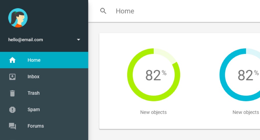
More will follow, and I’m particularly keen to get the dashboard sample converted: